It can be hard to use even the best websites sometimes. It can happen, not because the site is bad, but because users make mistakes as they look or click around. Many may not even be aware that these mistakes are preventing them from getting the best out of the sites they use.
Users can avoid making these mistakes, though, by following the guided help on websites. The site gives you tips as you go, like little signs that show you what to do when something goes wrong and where to click.
This post walks you through 5 common mistakes people make on websites and how getting help can stop them.
1. Clicking the Wrong Option by Accident
When you’re on a website, you might click on an option when you meant to click on something else entirely. If the buttons or icons don’t make sense or are too close together, this could happen.
That one wrong click stops users from doing what they wanted to do. You might accidentally go to a page or make a modification you don’t want to. That could make you stuck and possibly make you want to abandon the site.
2. Filling Out Forms With the Wrong Information
You may need to type your name, email address, or address into a form online. People sometimes make mistakes when they type, including using the wrong email address or forgetting to fill out a crucial field. This is quite common when people are in a hurry, are distracted, or don’t know what the form wants.
This form mistake can stop you from signing up or logging in. A lot of individuals give up when a form keeps stating “no” without giving them any obvious support.
3. Misunderstanding Navigation
Many visitors can see menus or links on a website without knowing what they signify. You can assume a button will take you to one destination, but it really takes you to another. This may happen when the wording on the menu isn’t clear or doesn’t make sense to you.
4. Skipping Instructions or Hints
You might see short messages that try to help you when you open a new page or do something different on an existing one. You can use these little tips to figure out what to do. They tell you the appropriate actions or how things work.
But a lot of people don’t read these. Sometimes they think they know what they’re doing. Some don’t pay attention to them, which means they could miss something important. They could click on the wrong thing or get stuck. This often happens when people visit a site for the first time or when a new feature is added.
5. Ignoring Error Messages or Not Understanding Them
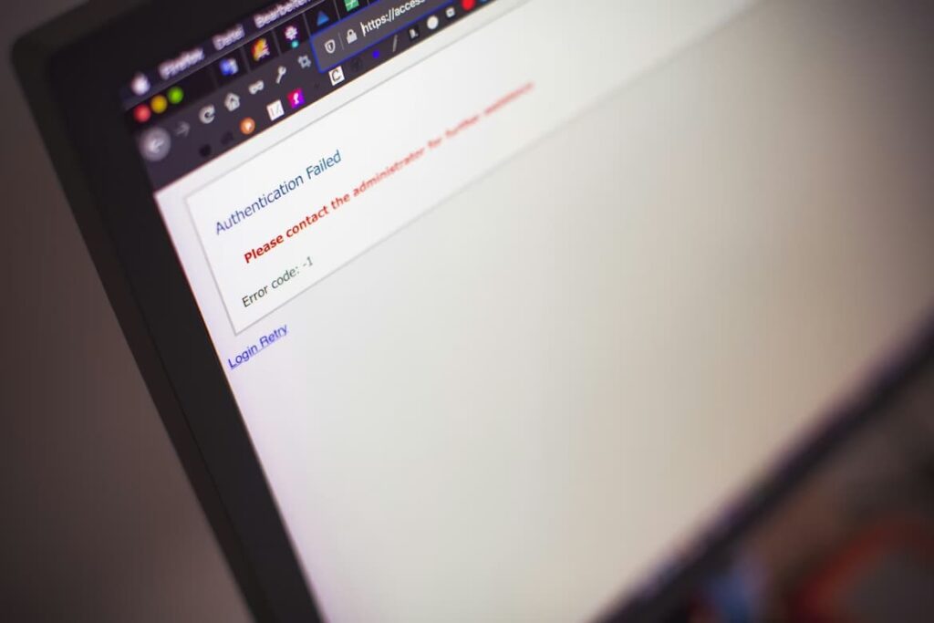
Have you ever typed something on a website and then saw a message like “wrong password” or “something is missing”? Sometimes users ignore these messages or don’t understand them.
When the message is not clear, users don’t know what went wrong or how to fix it. For example, if you typed a password but it says “invalid entry,” you might be unable to decide if the problem is that your password is too short or missing a number. If a message doesn’t tell you what to do, you might just give up and leave the site.
Guided Help That Should Prevent User Mistakes
Websites can help users avoid mistakes by providing relevant instructions! The next list illustrates simple techniques that websites can utilize to avoid the problems we talked about.
- Contextual tooltips: Little pop-up hints that appear just where you need them. They tell visitors what a button or icon does so they don’t guess wrong.
- Inline validation: Notifications that let users know straight away if they wrote something wrong in a form. This helps fix mistakes before they move on.
- Step-by-step walkthroughs: Short guided tours that show users how to do things one step at a time, so they never feel lost.
- Meaningful error messages: Basic notifications that tell visitors what went wrong and how to repair it instead of just saying “error.”
- Highlighted navigation tips: Arrows or colourful markings that point out crucial buttons or links so that users know where to go next.
- Progress indicators: Lines or numbers that show site visitors how far along they are in a task (like in a long form) so they don’t get confused or quit halfway.
Conclusion
People can make mistakes on websites. They can click the wrong button or type the wrong thing into a box. These blunders tend to occur because websites don’t always give obvious clues. With the right guided support, website owners can make it easier for users to navigate their platforms efficiently and prevent common mistakes.